New Zealand Trails – Website
Huge total redesign, tight timeframe? No problem! This is the evolution of a finely-honed sales machine.
Role: Web Designer
The New Zealand Trails website redesign is where I truly found my feet as a “creative mercenary” – that is, a freelancer brought in half way through a project where creative firepower and good ol’ speed & technical proficiency is needed yesterday. The client had an ambitious project on their hands – a rebrand, four new products, and a complete website redesign that retained all of the old IA…but on a newer, more modern platform.
I was called in as a Freelancer to help with the unexpected heavy lifting that this all entailed, both outputting all of the final design for the developer, and helping to guide the UX/UI as it evolved from its exploratory phase to something the user base would interact with instinctively.
This involved taking relatively final drafts of page designs in Illustrator and expanding them into complete prototypes with UX/UI that followed the established best practice of the time, creating responsive designs from there, and shifting the final output to Photoshop. Hard to believe there was a time not so long ago where this process was business as usual!
Funnily enough, this is a team I stayed with for several years after the initial website launch; the website has evolved multiple times since then, and I also had the pleasure of designing several iterations of the ensuing magazine and brochure.
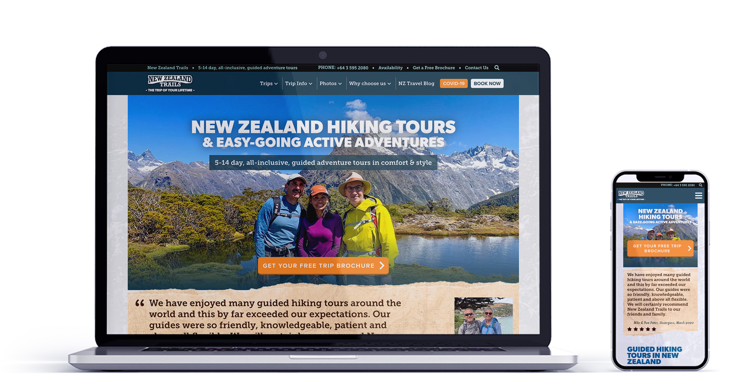
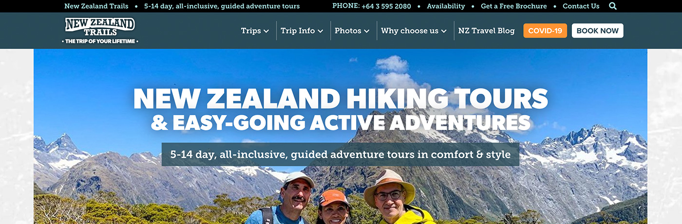
The New Zealand Trails website has a target audience of middle-aged and older, the vast majority of whom are from outside of New Zealand.
One of the first things that changed was a different approach to the copy on the website. Raising the default font size to 20px and keeping the contrast as high as possible was critical for this demographic, as was making sure interactive elements looked “buttony” and calls to action followed predictable logical flow. Many an A/B test has been run on this site to improve its interactivity on all device sizes, keeping that audience in mind.
Crucial to this process was making sure that a more “traditional” UI didn’t reflect as an out-of-date web experience. The company offers a high-end, high value, so the branding over the top needed to remain modern to reflect the up-to-date service…without avant-garde or experimental interactivity that might frustrate the target demographic. Much work behind the scenes went into tweaking those initial nearly-finished designs for this reason.
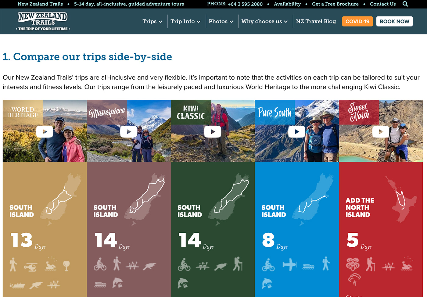
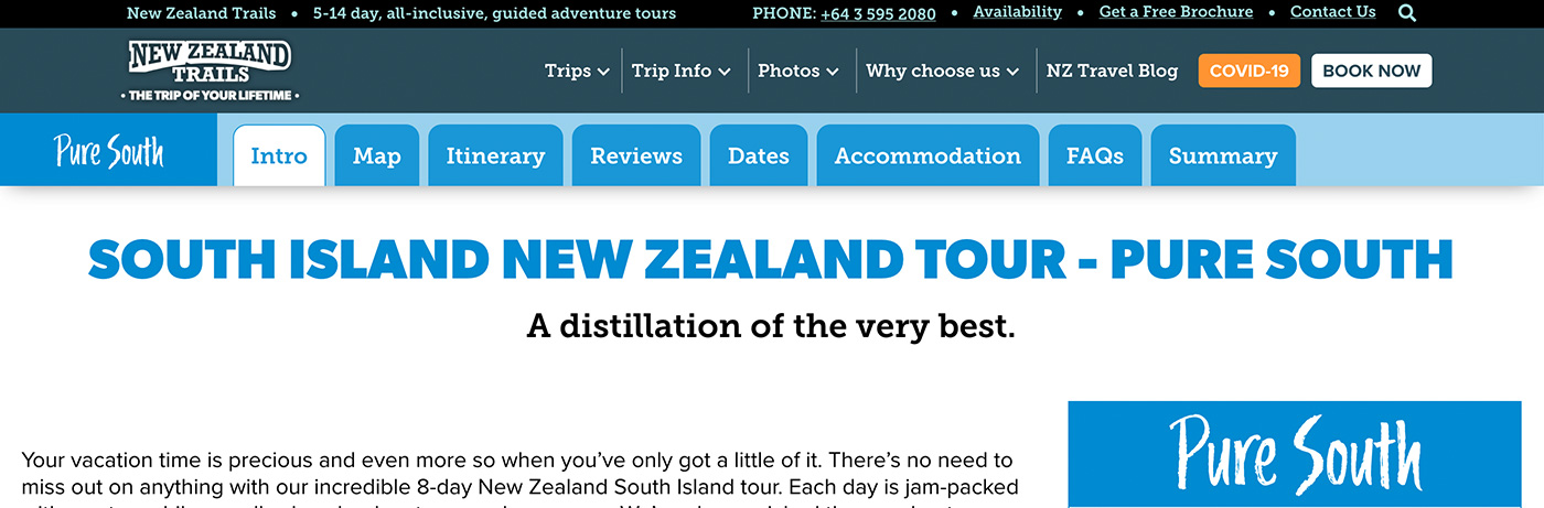
Much of the website focuses on displaying information; the target demographic tend to be deep researchers, with some enjoying a long read while others prefer to dissect tables of data. The New Zealand Trails website provides both in an easily digestible format, all while leading visitors to request a beautiful, glossy printed brochure they can peruse at their leisure.
As a travel website, imagery is also of utmost importance: get aspirational photos into their faces! All the imagery on the site is strategically sized and positioned so the best parts are above the fold and lead the user down into the page, but at a size where speed performance is still absolutely on point. A significant but rewarding challenge arose after the site’s initial launch where, with the huge amount of assets that are delivered to each page, we chased high GPI numbers to get performance and indexing absolutely dialled.
All in all, this is a high performance sales machine beneath an attractive, easy to use skin.
View this website here: newzealandtrails.com