Treebrush Apothecary – Brand Suite
A complete identity suite from start to finish, this project is a little different. This is a side hustle turned main hustle where I was able to conceptualise both the product itself and every facet of its design following.
Role: EVERYTHING
Treebrush Apothecary started off life as a curiousity back in 2019. My father has been in the cosmetic and raw ingredient industry for decades, and as such, there was always a plethora of samples to play with as I grew up. A brush with another manufacturer’s product prompted me to get into it myself, where it served as a stimulating exercise in brand development as much as product development in my free time after work.
Naturally, 2020 drastically changed how this would play out in the immediate and long term.
At this stage, I had just three products (“No Regerts”, and twin balms “Thuck” and “Thun” – say it out loud!), early runs at packaging design, and so many questions about the future while living and working in a town whose lifeblood was overseas tourists. Having eventually run out of work while we were all in lockdown and the borders remained closed, this project became my majority focus from 2020 onward.
Branding

Font selection
Part of the excitement about this project was the prospect of being able to lean into some serious font nerdery.
I’m pretty darn passionate about fonts; there are so many facets to selecting the ideal one for a brand, and getting it right from the very start is worth the extra sweat.
Something I wanted for Treebrush Apothecary was a pair of humanist, cheeky, somewhat delicate fonts paired in a balanced logotype. These two share similar x-heights, though I modified the ascenders and descenders of the larger word to maximise the size of the smaller word – if you’re gonna print something small, you want to be able to read it!
The end result is a logo that is friendly and modern, able to target a broad audience without being suggestive of a target gender or age group.
Colour suite
Another thing I’m passionate about is getting a colour suite nailed. I’m a firm believer in keeping it simple – choose a punchy key colour, match a delicious highlight colour or two, and walk away. Walk away!
In this case, because this was always intended to have a strong web presence and a full suite of matched products, the two key colours have an alternate each. Dark, in the case of the blue. Light, in the case of the teal. The colour-matched flexibility for web means I was able to lead the viewer’s eye around the resulting website with high contrast CTAs without sacrificing colour harmony; the whole thing still tastes on brand, because the bright green standout colour is a direct derivative of the key blue.
As for the blue itself being the key colour: rather than blending in among a sea of green-hued eco brands, this one instead leans into ocean blues and teals as a nod to New Zealand’s island nature. When used as a gradient, it packs a bright, eye-catching punch – even in print.

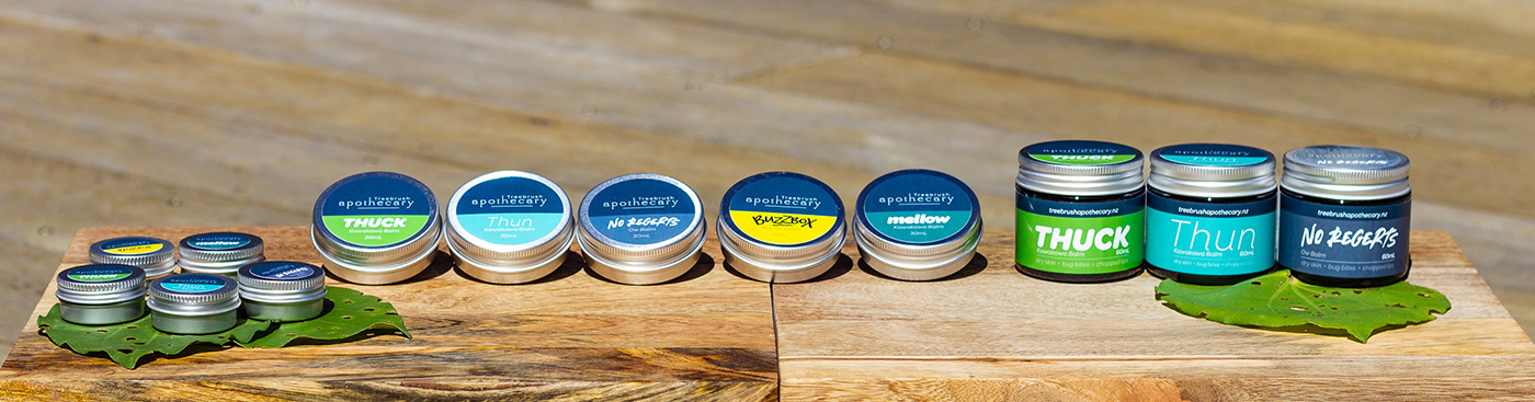
All but two products have directly related key colours as well, with the intention of creating harmony across a busy table of products lined up alongside each other. Regular users recognise “their” product among the lineup immediately, and recognise the brand among others; each has its own distinct look, but is colour-matched to unite with the rest of the brand.
The two exceptions are a honey-based balm which needed an inappropriately loud yellow-and-black combo that wasn’t calculated from the original blue, and a vegan balm that needed a warmer, earthier tone compared to the rest of the suite.
Product logos/branding
Given the start the project had with silly names buried under professional-looking branding, a theme was very much established from the outset. Make each product look slick and stand on its own two feet, but if possible, bury a dad-joke name among the pixels!
Each individual product ‘brand’ ties back to the parent Treebrush Apothecary brand, with a key colour generated from the Treebrush Apothecary blue and a typeface that fits with the whole suite.
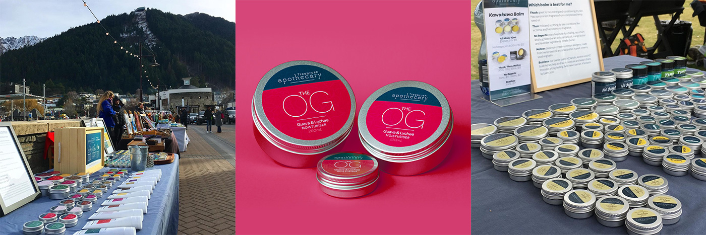
Because each logo follows the internal conventions of Treebrush Apothecary’s branding first and foremost, they are all recognisably part of the same brand while also clearly displaying their own personality. As a result, Treebrush Apothecary products are becoming increasingly recognisable; it’s been a delight to have people quite excitedly spot my products from a distance at markets!
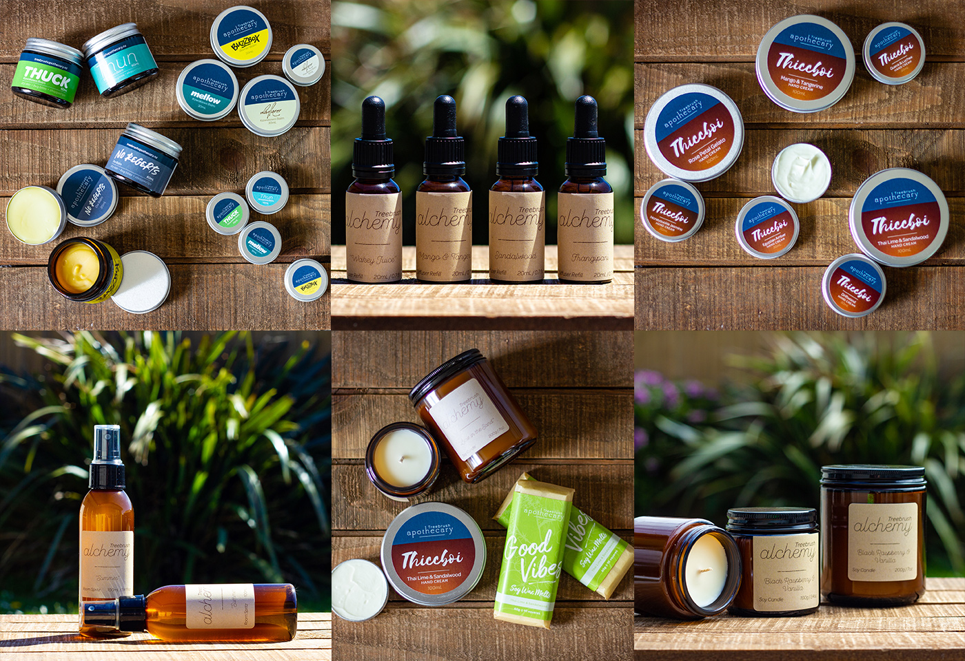
Photography
After years (decades!) of encouraging clients to use the best product/service photography available to them, the shoe’s on the other foot here!
I’ve made pretty epic use of my old Canon 550D and a borrowed 50mm prime lens over the years with Treebrush Apothecary. Composition, colour, focus and knowing what will pop is as much art as it is science; suffice it to say I’ve learned a thing or two about creating a rockstar shot cobbled together with bits and pieces from the surrounding environment!
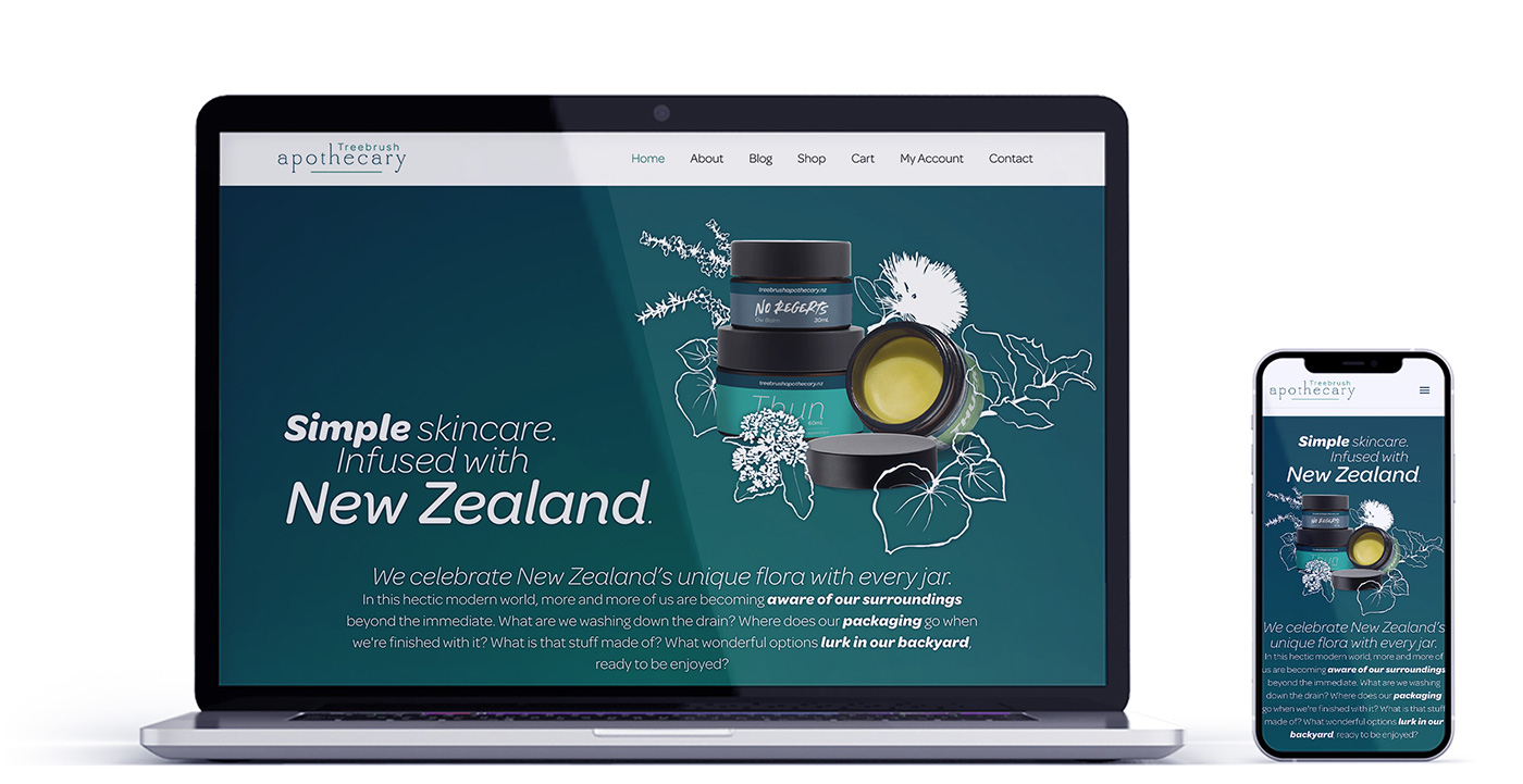
Website
This is probably the fastest website I’ve ever designed and developed, and easily the one I’ve had the most involvement in ongoing development and maintenance.