1up Brewing – Beer Cans
Nerdy gamer beer can illustrations: a creative’s dream come true!
Role: Graphic designer, illustrator
One of the coolest jobs I’ve had to date as a freelancer, I was commissioned by a brewery to design the branding and visuals for their line of nostalgic gamer-themed beers, 1Up.
Each beer has a distinct flavour profile that ties into a specific game theme, and the designs all invoke the “old school” 16-bit game sprites many of us grew up with.
Branding
The 1Up brand was originally conceptualised as the unholy union of all our favourite old school games, using Minecraft as the initial springboard of ideation.
A collection of ‘pixel’ fonts make up the final result, with a custom stroke-into-3D outline. We chose a more modern colour suite set in a gradient to keep the overall design tethered in the modern era, and to make the cans even more recognisable on the shelf.
Alex
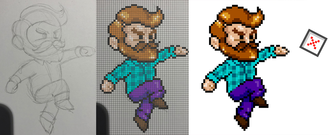
The brand avatar/character is “Alex”: a plaid-shirted beer hipster illustrated in pixel art. Eagle eyes might notice the colour tie-in between him and the logo, and notice they also draw from Steve of Minecraft fame.
Taking my hand-drawn sketches of the character and converting them to press ready pixel art led me to create a new method of illustrating: overlaying an 80×80 box of small vector squares with the art, I was able to essentially trace the line art and tweak it all to work beautifully as “game sprite” art, while also benefitting from the flexibility of vector. It may have also practically set my MacBook on fire in the process. There’s a LOT of anchors in these pieces!
The cans
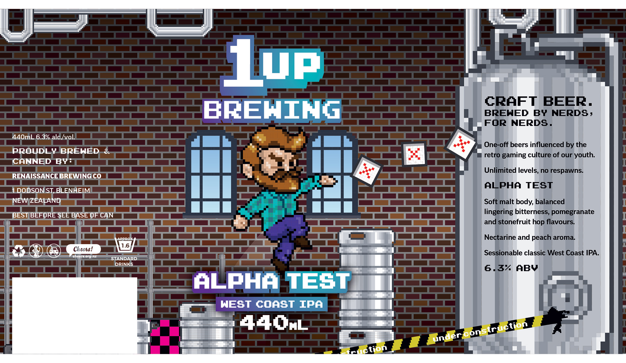
“Alpha Test” West Coast IPA
First off the mark, and as the name suggests, an alpha test to see how the concept lands and how challenging the artwork would be to produce. This stretched the limits of the pixel art technique at the time, but we were stoked with the results!
The final cans also have a white spot underlay, letting parts of the metal can underneath give design elements like the silos and kegs a natural metallic finish while the logo pops in its native white.
After a successful run with Alpha Test, we launched the first “season” of beers.
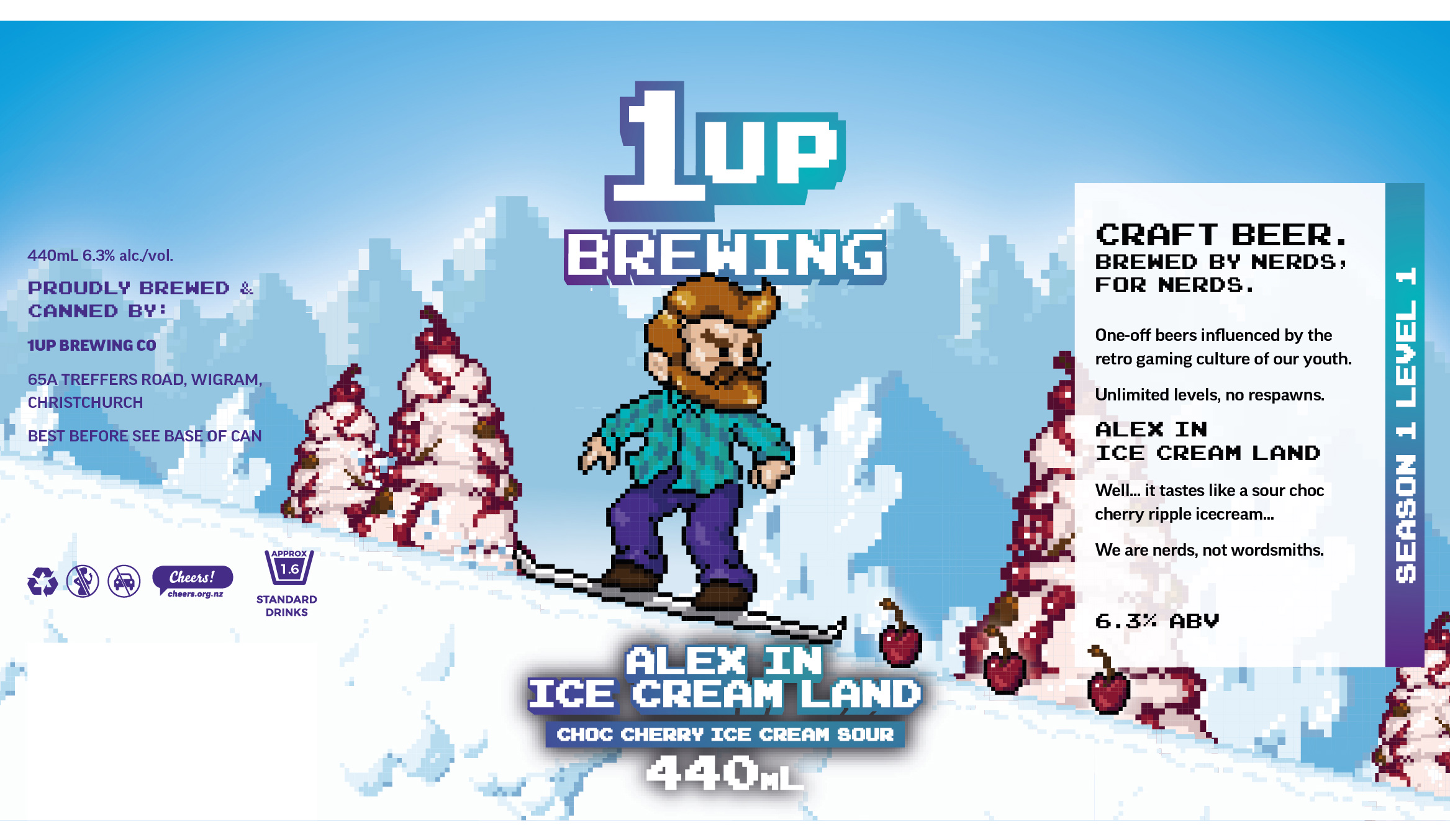
Season 1 Level 1: “Alex in Ice Cream Land”
This one’s brief was basically “make it happen” – naturally, I drew inspiration from one of my favourite games growing up and we have Alex snowboarding down a mountain instead of Sonic.
This one contained a fair few more hand drawn elements that got turned into pixel art square by square, but this was definitely the point the project gained traction and its own distinct artistic style.
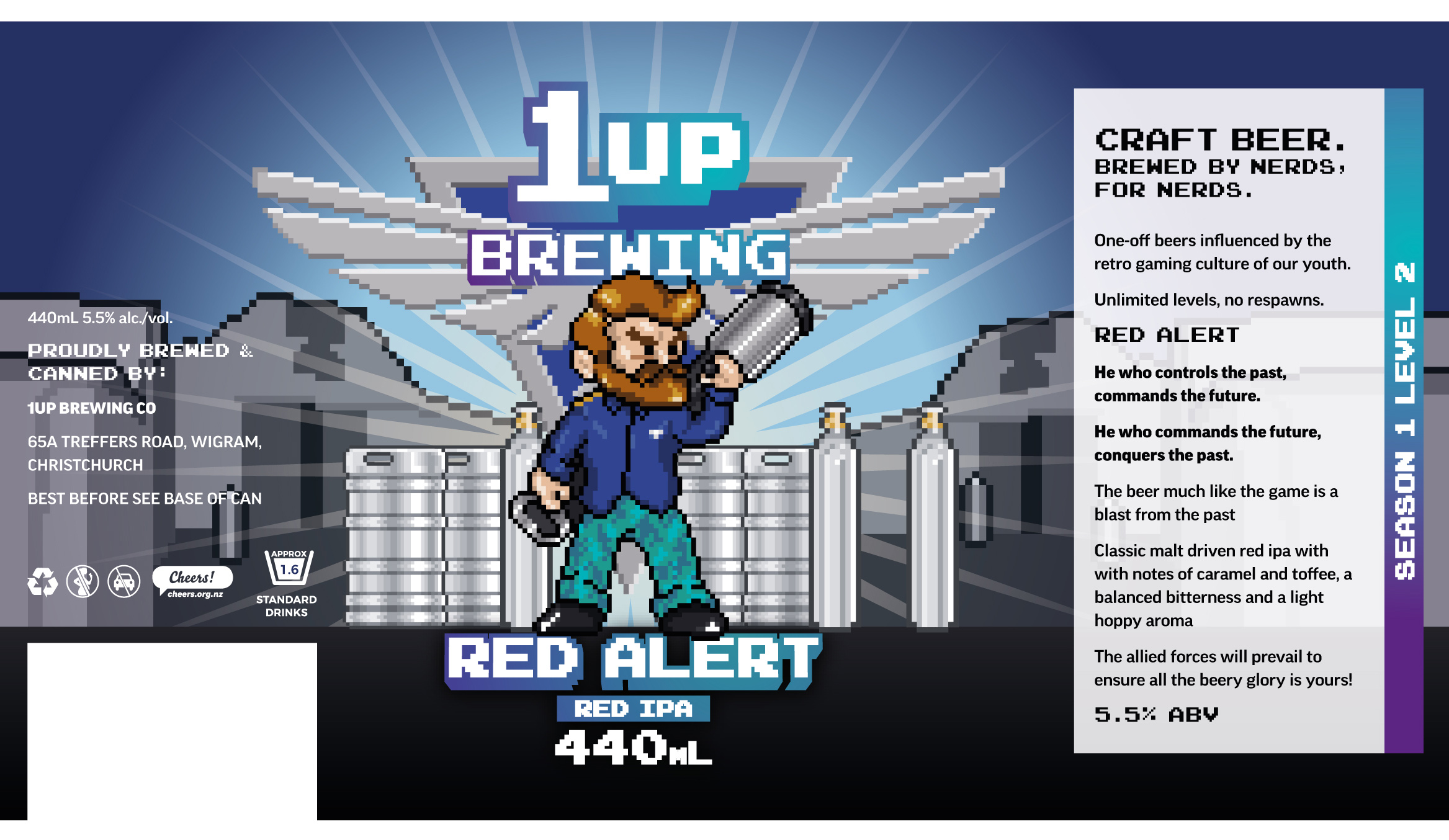
Season 1 Level 2: “Red Alert”
For the next can, the client had a specific game in mind – Command & Conquer: Red Alert. We wanted it to be recognisable without being a rip-off, and chose the blue theme given the state of global affairs in early 2023.
As an extra nod the brewery itself, a heritage building in Blenheim, features in the background art.
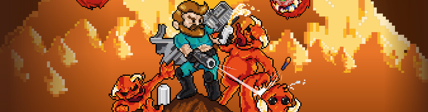
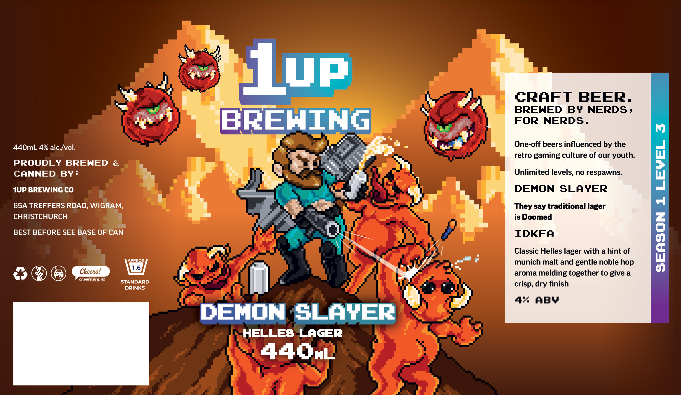
Season 1 Level 3: Demon Slayer
The fouth can design sparked a change in tactics. The game inspiring this one was the original Doom, and we decided to riff on the highly recognisable cover art. This meant a whole lot more drawing was required…so draw I did!
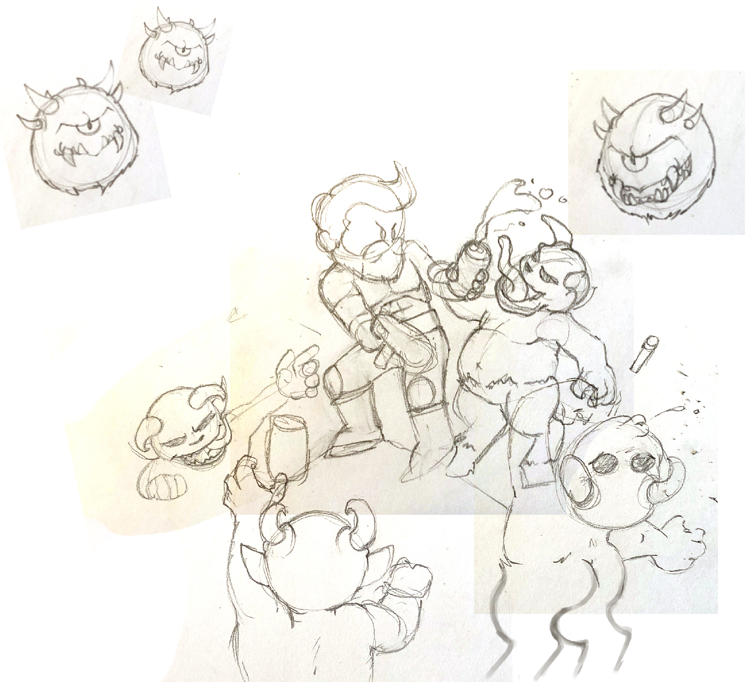 Having each character roughly illustrated then composed in Photoshop made it vastly easier to nail the finished art of a far more complex piece – and it sure was nice to go back to basics with a project!
I was stoked to hear that the client also submitted this design for a can art award.
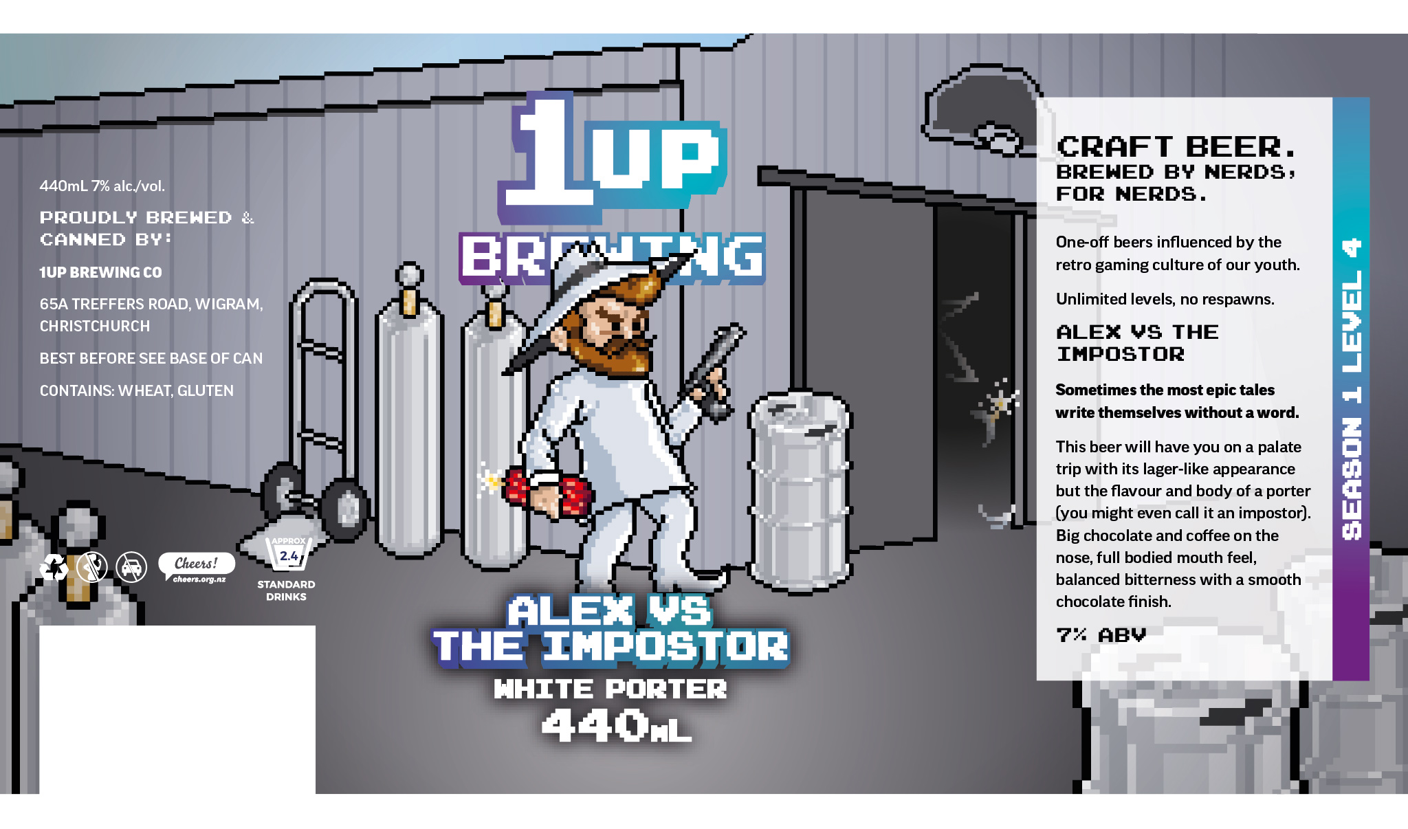
Season 1 Level 4: Alex vs The Impostor
Part of a two beer pair, the next can design is a nod to another childhood classic: Spy vs Spy.
We stripped the colour palette back for this one and revisited the brewery. Like Demon Slayer, this one was heavy on the hand illustration to start and went through several iterations before landing on this design.
A cheeky little in-joke that’s formed at this point is that our boy Alex keeps growing with each design, too!