New Zealand Trails – Magazine & Brochure
The boldest, most beautiful (and over-the-top) brochure for a walking tours company. Probably.
Role: Graphic Designer
Having joined New Zealand Trails as a freelance web designer at the 11th hour and gotten a huge project across the line, I was asked if I knew any graphic designers looking for work. Funnily enough, I did!
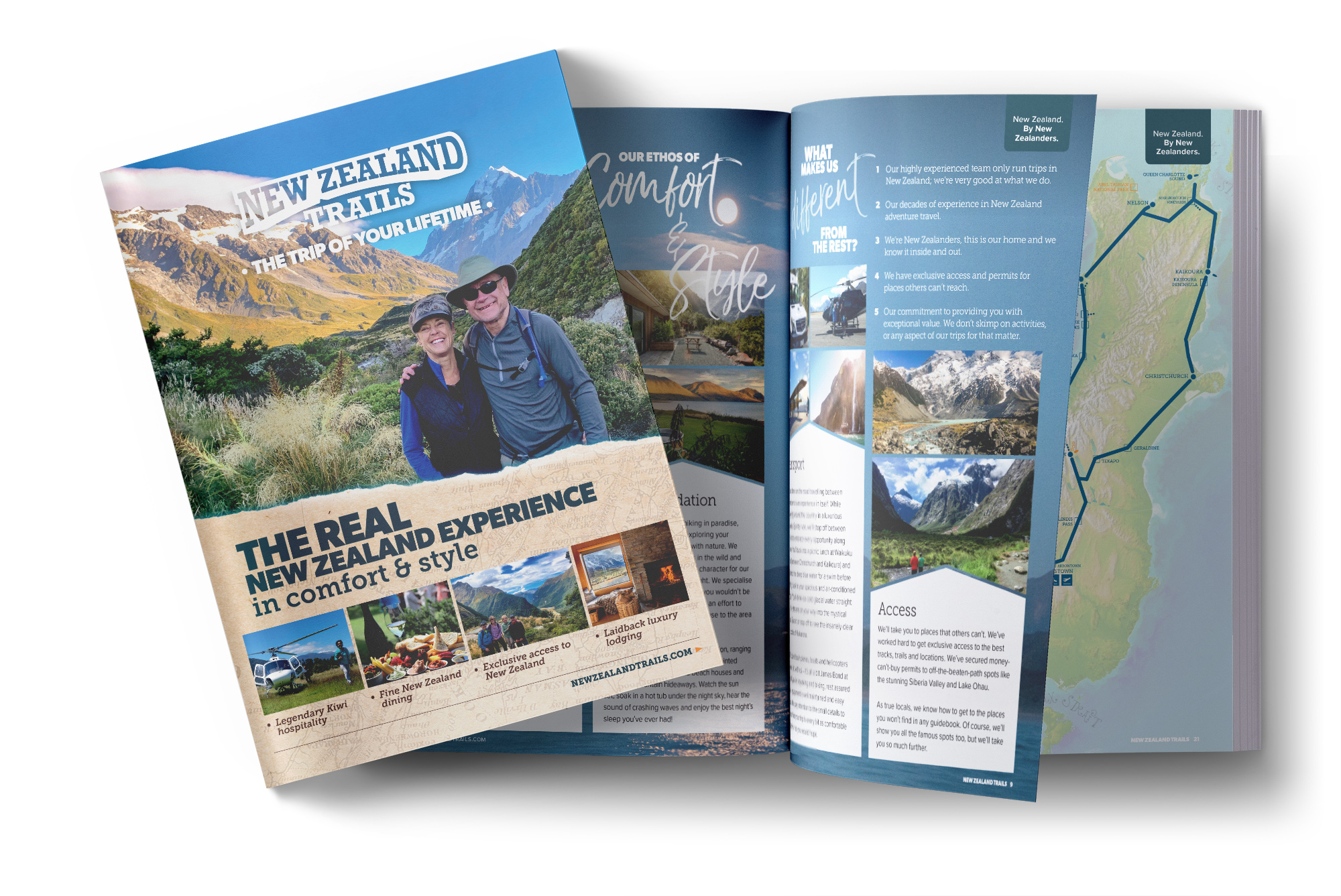
The next project was a big’un. Leads generated from the gorgeous, high-performing new website would be mailed a brochure filled with all the relevant information about the company’s products with beautiful photography and inspiring stories. This had worked brilliantly in the past, but it was time for a massive upgrade. This magazine was intended as both an informative document and a gorgeous coffee table keepsake.
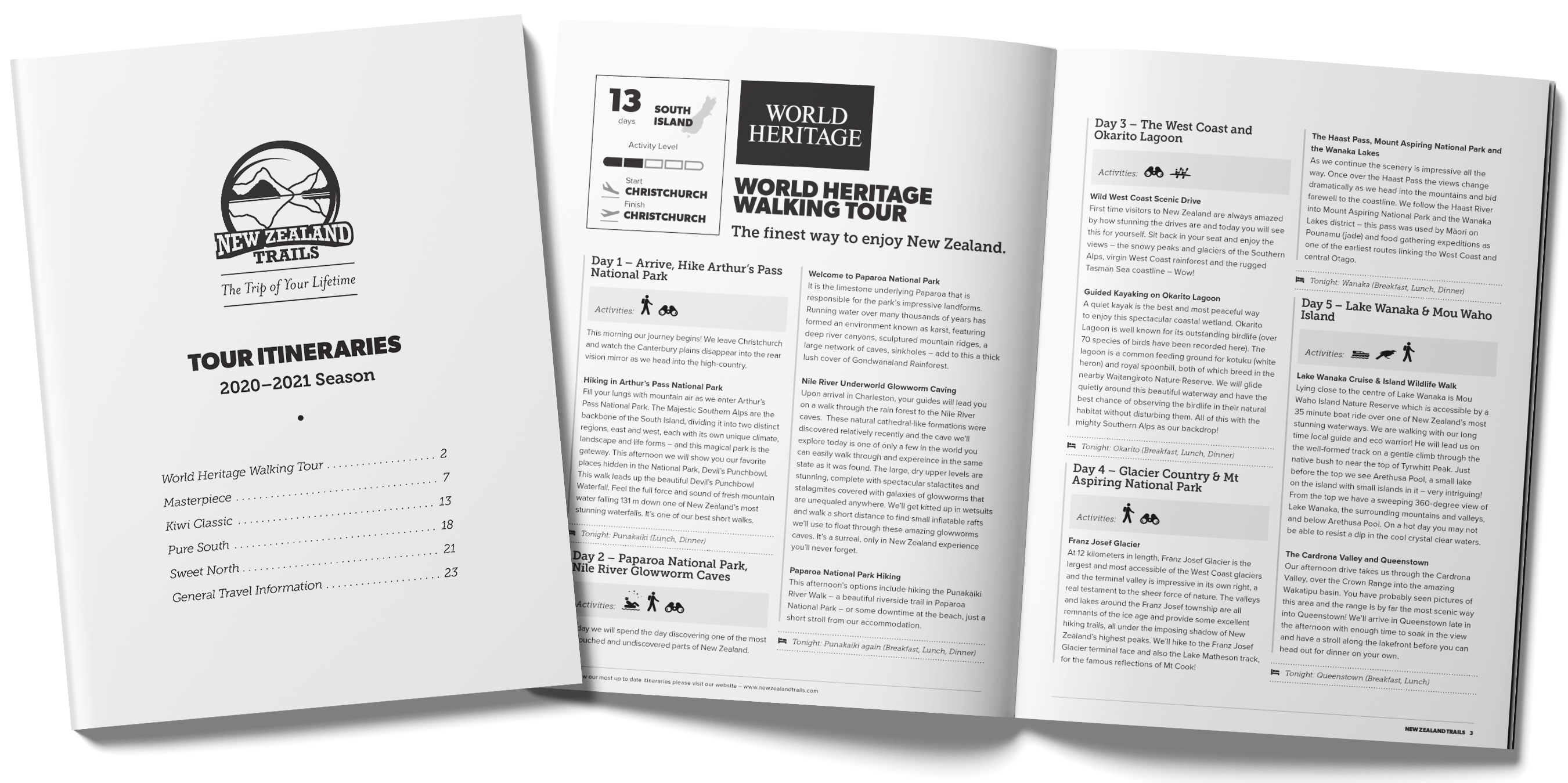
More than just a brochure, this was an 84-page PUR-bound beast of a magazine. And I had the pleasure of designing and laying up the entire project from a series of rough outlines onward, making generous use of the new typefaces and branding.
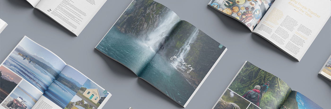
This project made full use of all my prior work in publishing and it’s still one of the pieces I’m most proud of at this end of the creative industry. Bold opening spreads for editorial articles, sharp layouts between, tidy and informative itineraries…it was a joy to have so much creative freedom with a classy publication as the end goal.
Other print publications
Naturally, this led to further print publications.
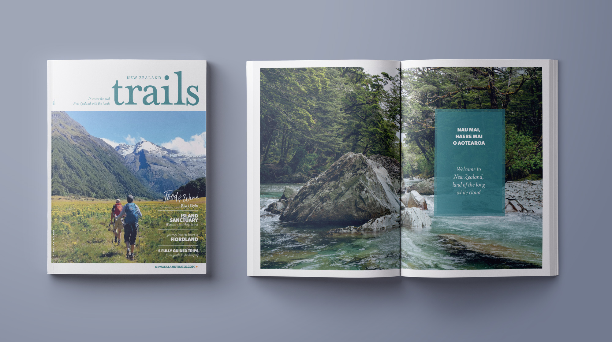
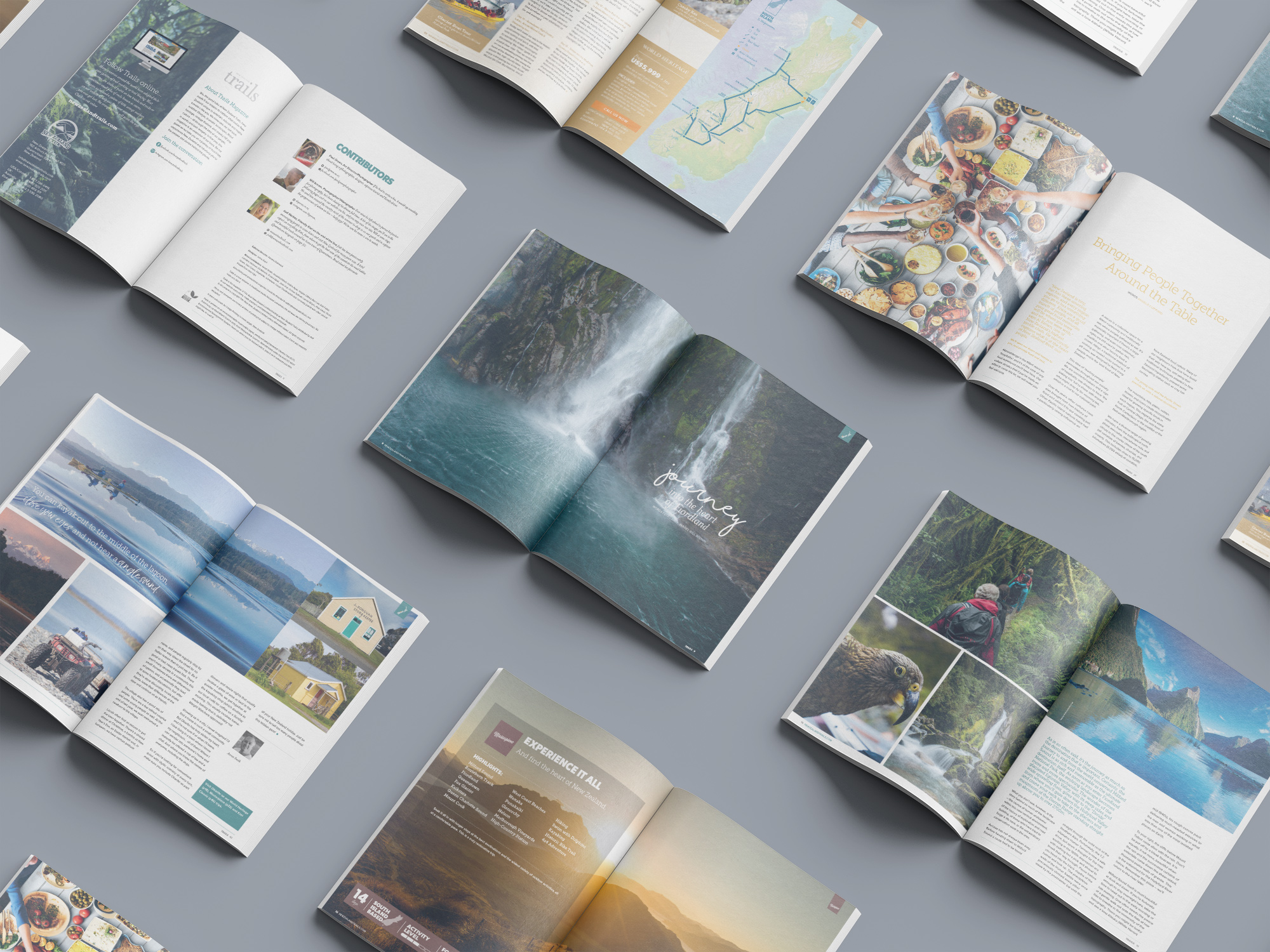
The following season’s brochures heralded a return to more targeted documents; these were intended to be more directly informative of the company’s products, lightweight, and impactfully glossy. We discussed a switch to more “smiley customer” focused imagery and detail-heavy itineraries.
The brochures have largely followed this format since, requiring heavy use of the entire Adobe creative suite to tie tactile imagery together into engaging and intuitive layouts.
With the brochures carrying the lion’s share of the eye-catching imagery, the detail-heavy version of the itineraries was also split off into its own black-and-white insert; this was an awesome back to basics layup project that I thoroughly enjoyed. Perfecting a simple information hierarchy document is weirdly satisfying. Fellow creatives will know the feeling!